


Rebranding- Sea Life
Aquarium
The graphical elements that I chose to be preserved are the typeface of the logo because it does not affect how I’m going to rebrand the logo and also it expresses the nature of the sea. I had only adjusted the colour of the typeface to dark blue so it looks more professional and it represents the colour of the sea. Furthermore, I still keep the concept of the starfish on the logo but I replace it to the colourful corals and three colour seaweeds. The parts that I’m going to change in the logo are rearranging the colourful corals next to the logo ‘Sea Life Sydney’.
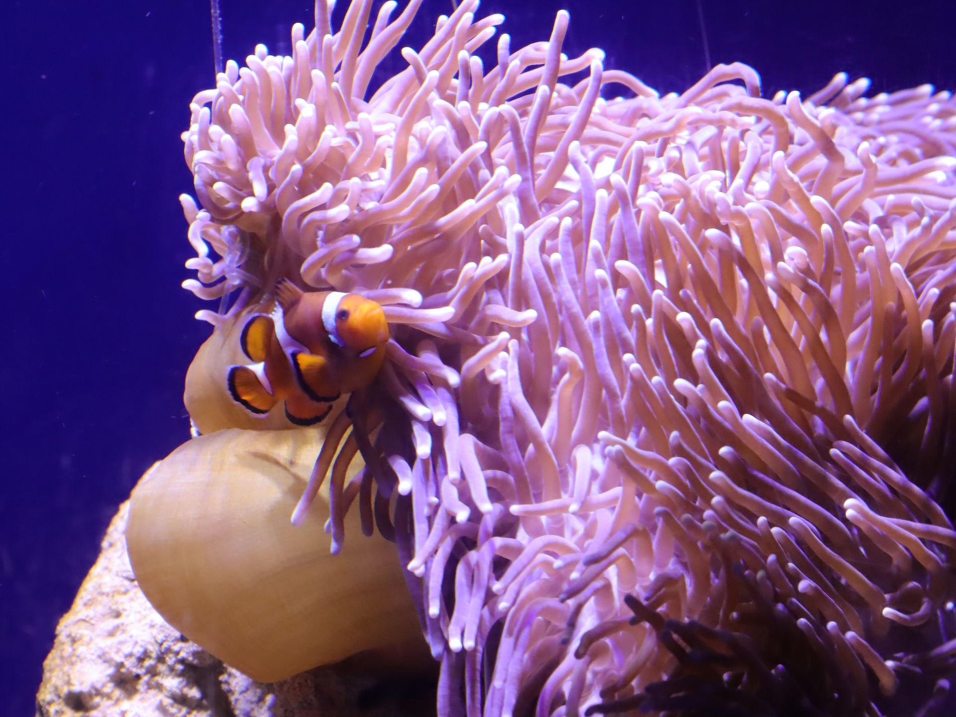
Through taking photos of the different angles of the fishes, corals, penguin, and sharks it had given me some inspiration of rebranding the logo. Also, I had taken various atmospheres of every section and the children interaction of different activities like touching the starfish and sea cucumber, reading information of every section about each sea creatures, fishes, penguins, and sharks as well. Rebranding the logo of Sea Life Sydney will gain more interest in the audience and willing to explore under the sea.